Work day
Materials for class on Monday, December 2, 2019
Contents
Slides
No slides today!
Drawing random numbers from distributions
Often when you generate data it’s helpful to make the data follow a kind of distribution. For instance, if you generate synthetic incomes, you’ll generally want a cluster of incomes around some average, with most incomes within some range around the average (and a handful of really small and really big ones). For other values, you might want a full range instead of a cluster; for others, you might want a skewed distribution with mostly small numbers and a handful of larger numbers.
Values in the real world can be modeled as distributions: specific shapes of how often different values appear. R has a bunch of distribution-related functions for calculating percentiles (pnorm(), pbeta(), etc.), quantiles (qnorm(), qbeta(), etc.), and drawing random values (rnorm(), rbeta(), etc.). There are nearly 20 distributions built in to R: run ?Distributions or go here to see them all. There are also a ton of examples online about how to work with and plot these distributions (like this, for instance).
Make sure you look at the help page for the distribution you want to use to figure out the arguments you need. For normal distributions (rnorm()) you have to specify a mean and standard deviation; for Poisson distributions (rpois()), you specify a λ (lambda); for uniform distributions you specify a minimum and maximum; for beta distributions (rbeta()) you specify two shape parameters (see this post for details about what those mean).
When you’re generating synthetic data for your final project, you generally just have to tinker with the different parameters until it looks good. Sometimes you’ll have a population average and standard deviation for some value (like income), and you can use that; sometimes you’ll have to make it up as you go.
Here’s how to use a few of the main distributions:
library(tidyverse)
library(patchwork)  # For combining ggplots

# Make all this randomness reproducible
set.seed(1234)

# Round everything to 3 digits by default
options("digits" = 3)
dist_stuff <- tibble(
# Normal dist. of income with $40k average and $10k sd
income = rnorm(n = 2000, mean = 40000, sd = 10000),
# Uniform distribution of wait time from 1 minute to 2 hours
wait_time = runif(n = 2000, min = 1, max = 120),
# Number of kids as Poisson, with most around 1 and 2
n_kids = rpois(n = 2000, lambda = 2)
)plot_norm <- ggplot(dist_stuff, aes(x = income)) +
geom_histogram(binwidth = 2000, color = "white")
plot_unif <- ggplot(dist_stuff, aes(x = wait_time)) +
geom_histogram(binwidth = 5, color = "white", boundary = 0)
plot_pois <- ggplot(dist_stuff, aes(x = n_kids)) +
geom_histogram(binwidth = 1, color = "white") +
scale_x_continuous(breaks = 0:10)
plot_norm + plot_unif + plot_pois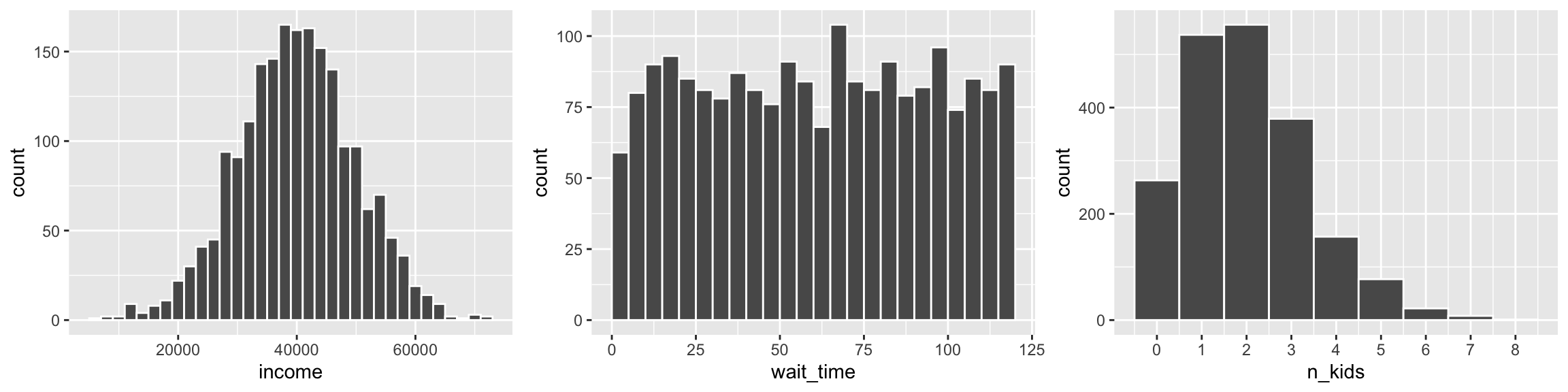
Sometimes it’s helpful to constrain the random numbers you generate to fit reasonable numbers. For instance, if you want to simulate test scores for a test with a maximum of 100 and an average score of 80, some random scores might exceed 100. You can install the truncnorm package and use a special version of rnorm() named rtruncnorm() that will draw random numbers from a truncated normal distribution, which means you can put upper and lower bounds on the numbers it creates. Notice how the regular rnorm() here generates test scores that are too high, while rtruncnorm() doesn’t:
library(truncnorm)  # For truncated normal distributions

truncated_stuff <- tibble(
  scores = rnorm(n = 2000, mean = 85, sd = 10),
  # Use a for the lower bound; b for the upper bound
  scores_truncated = rtruncnorm(n = 2000, b = 100, mean = 85, sd = 10)
)

plot_scores <- ggplot(truncated_stuff, aes(x = scores)) +
  geom_histogram(binwidth = 5, color = "white", boundary = 90) +
  geom_vline(xintercept = 100)

plot_scores_trunc <- ggplot(truncated_stuff, aes(x = scores_truncated)) +
  geom_histogram(binwidth = 5, color = "white", boundary = 90) +
  geom_vline(xintercept = 100)

plot_scores + plot_scores_trunc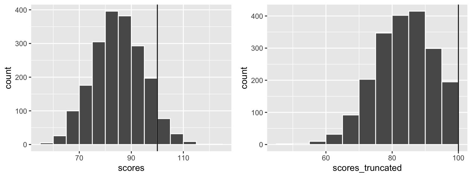
Another issue that often arises when generating data is that it doesn’t quite look like it would in real life. Suppose you have a survey question with responses that range from 1-7 (like a Likert scale that ranges from “Very unsatisfied” to “Very satisfied”). You want most of the responses to be around 3 or 4, but you don’t want anything above 7 or below 1, so you use rtruncnorm():
survey <- tibble(
  satisfaction = rtruncnorm(2000, a = 1, b = 7, mean = 4, sd = 2)
)

ggplot(survey, aes(x = satisfaction)) +
  geom_histogram(binwidth = 1, color = "white") +
  scale_x_continuous(breaks = 1:7)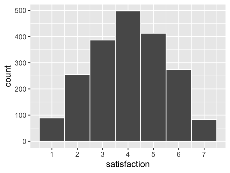
That all looks great until you look at the data itself:
## # A tibble: 6 x 1
##   satisfaction
##          <dbl>
## 1         1.29
## 2         3.07
## 3         1.98
## 4         3.94
## 5         3.90
## 6         3.73
In real life people can’t respond with a 3.234 or 1.953; they have to choose a 3 or a 1. We want to change our synthetic data to match what it would look like in real life. There are several ways to do this with R: we could round the number to the nearest whole number with round(NUMBER, 0), we could force rounding up with ceiling() (so 3.1 would turn to 4), we could force rounding down with floor() (so 3.9 would turn to 3), or we could lop off all the decimals with trunc(). Because this is all fake data, it doesn’t really matter which method we use—if you were using real data you’d want to think carefully about how to round or floor/ceiling or truncate your data.
It’s easiest to generate the fake data and then fix it with mutate():
survey <- tibble(
  satisfaction = rtruncnorm(2000, a = 1, b = 7, mean = 4, sd = 2)
) %>%
  mutate(satisfaction = trunc(satisfaction))

head(survey)
## # A tibble: 6 x 1
## satisfaction
## <dbl>
## 1 4
## 2 4
## 3 4
## 4 3
## 5 2
## 6 4Finally, sometimes it’s hard to get a consistent range with rnorm()—generated values might be higher or lower than you expect. An alternative to using rtruncnorm() is to scale the generated values up to some reasonable range after the fact using rescale() from the scales library. Notice here how I generate some random values with rnorm() but with the default mean of 0 and standard deviation of 1. I then use rescale() to shift that tiny distribution up to something more reasonable for some company:
library(scales)

incomes <- tibble(
  income_tiny_normal = rnorm(2000, mean = 0, sd = 1)
) %>%
  # Make income range from $35,000 to $200,000
  mutate(income = rescale(income_tiny_normal, to = c(35000, 200000)))

head(incomes)
## # A tibble: 6 x 2
## income_tiny_normal income
## <dbl> <dbl>
## 1 0.651 132720.
## 2 -0.0920 114053.
## 3 0.796 136378.
## 4 0.918 139434.
## 5 -0.906 93593.
## 6 -0.654 99936.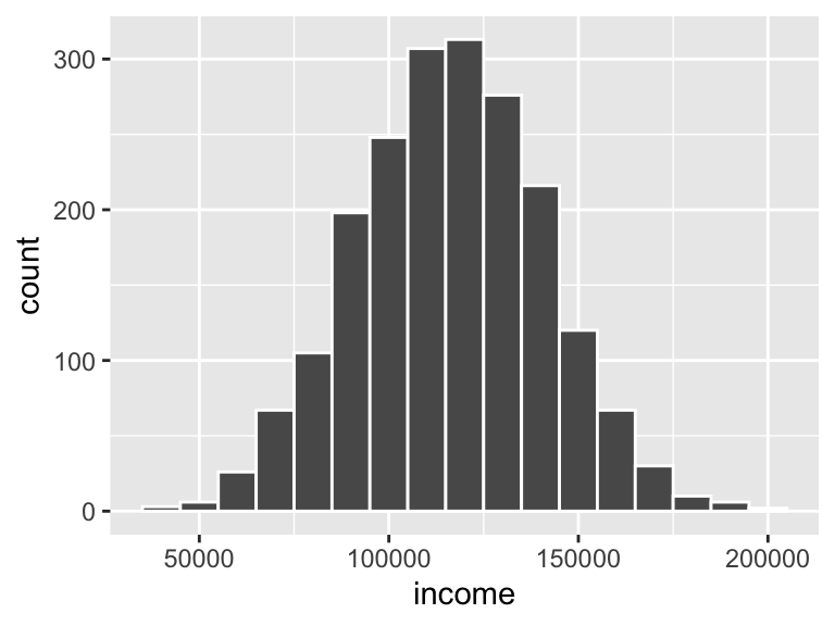
Using wakefield
You can use distribution functions to generate numeric data, but generating categorical data is a little trickier. The normal way to generate categories is to provide R with a list of possible categories and then sample (or draw randomly) from that list, like so:
sampled_stuff <- tibble(
  # Choose from one of 4 colors, 2000 times
  color = sample(c("Red", "Blue", "Green", "Yellow"), size = 2000, replace = TRUE),
  # You can specify probabilities too and make it so there's a 58% chance that
  # "Democrat" will be chosen
  party = sample(c("Democrat", "Republican"), size = 2000, replace = TRUE,
                 prob = c(0.58, 0.42)),
  # Here we pretend that 30% of the population was in the treatment group
  treatment = sample(c("Treatment", "Control"), size = 2000, replace = TRUE,
                     prob = c(0.3, 0.7))
)

head(sampled_stuff)
## # A tibble: 6 x 3
## color party treatment
## <chr> <chr> <chr>
## 1 Blue Democrat Control
## 2 Green Republican Control
## 3 Yellow Democrat Treatment
## 4 Red Democrat Treatment
## 5 Blue Democrat Control
## 6 Red Democrat ControlAll of that sample() stuff can get tedious, though, and finding/knowing the baseline probabilities for things like political party can take time. The wakefield package can simplify all this for you, though. It comes with 49 special functions that generate data for you (run variables() to see a list of all the possibilities). You use these special functions in r_data_frame(), which mostly acts like tibble(), but forces you to specify the number of rows to generate first with n =. If you use the function name by itself, it’ll use all the default arguments (see the help page for each function, like ?political, to see what those are). You can also specify your own arguments.
library(wakefield)

fancy <- r_data_frame(
  n = 2000,
  id,
  color,
  political,
  group = group(prob = c(0.7, 0.3))
)

head(fancy)
## # A tibble: 6 x 4
## ID Color Political group
## <chr> <fct> <fct> <fct>
## 1 0001 Mediumseagreen Democrat Treatment
## 2 0002 Gray62 Democrat Control
## 3 0003 Lemonchiffon1 Democrat Control
## 4 0004 Floralwhite Democrat Control
## 5 0005 Lightseagreen Democrat Control
## 6 0006 Grey67 Republican ControlYou can also use the regular rnorm() and runif() functions inside r_data_frame(). One advantage of doing this is that you don’t have to repeatedly specify the n—it’ll naturally carry through to all the functions inside r_data_frame():
super_fancy <- r_data_frame(
  n = 2000,
  id,
  gender_inclusive,
  income = rnorm(mean = 35000, sd = 15000),
  gpa = runif(min = 1.5, max = 4.0),
  test_score = rtruncnorm(b = 100, mean = 85, sd = 10)
)

head(super_fancy)
## # A tibble: 6 x 5
## ID Gender income gpa test_score
## <chr> <fct> <dbl> <dbl> <dbl>
## 1 0001 Male 20495. 3.61 71.0
## 2 0002 Male 27543. 2.80 96.6
## 3 0003 Male 23591. 1.94 89.5
## 4 0004 Female 24342. 3.65 86.3
## 5 0005 Male 30014. 2.52 82.6
## 6 0006 Female 59602. 2.66 74.4Making adjustments with trunc() or round() or rescale() won’t work inside r_data_frame(), but you can do that after with mutate():
super_fancy <- r_data_frame(
  n = 2000,
  id,
  gender_inclusive,
  income_tiny = rnorm(),
  gpa = runif(min = 1.5, max = 4.0),
  test_score = rtruncnorm(b = 100, mean = 85, sd = 10)
) %>%
  mutate(gpa = round(gpa, 2),
         income = rescale(income_tiny, to = c(35000, 200000)))

head(super_fancy)
## # A tibble: 6 x 6
## ID Gender income_tiny gpa test_score income
## <chr> <fct> <dbl> <dbl> <dbl> <dbl>
## 1 0001 Male -1.25 3.71 90.1 79707.
## 2 0002 Trans* -0.680 3.19 85.5 93149.
## 3 0003 Trans* 0.379 3.53 74.5 118267.
## 4 0004 Female -1.45 1.79 98.0 74908.
## 5 0005 Male 0.112 3.29 78.1 111924.
## 6 0006 Male -0.672 3.48 67.2 93338.In general, it’s best to generate fake data with r_data_frame() first, then make any adjustments or changes afterwards with mutate(), filter(), and gang.
Creating a fake program effect
In your final projects, you’re designing evaluations that try to measure the effect of some social program using econometric tools. It’s often helpful to build that effect into your synthetic dataset so that you know if your model has found the effect. There are a ton of different ways of doing this. I’ll show a few ways below (but this is not an exhaustive list of approaches)
RCTs
Suppose you have some experimental program that was offered in some randomly assigned villages. You can generate two datasets (one for the treatment villages and one for the control villages), increase the outcome in the treatment villages, and combine the two datasets into one with all villages.
Here I create a column named pct_boost that generates a random number around 1.3 for the treatment group. I then multiply that number by the pre-treatment income to create the post-treatment income. If the boost is 1, there won’t be any change; if it’s 1.3, there will be a 30% change (e.g. changing income from $100 to $130). I make a similar boost for the control group, but only 1, meaning that on average there won’t be any increase (though, since it’s randomly generated, some people in the control group will see a slight increase or decrease).
(Instead of multiplying by percentages, I could also just say post_income = pre_income + 200 and boost everyone’s income by exactly 200, or do post_income = pre_income + rnorm(mean = 200, sd = 50) to boost everyone’s income by 200 ± 50ish—again, there are lots of ways to do this).
set.seed(1234)
village_treatment <- r_data_frame(
  n = 500,
  age,
  sex(prob = c(0.6, 0.4)),
  pre_income = rnorm(mean = 800, sd = 100),
  pct_boost = rnorm(mean = 1.3, sd = 0.3)
) %>%
  mutate(post_income = pre_income * pct_boost) %>%
  mutate(experiment_group = "Treatment")

village_control <- r_data_frame(
  n = 1000,
  age,
  sex(prob = c(0.6, 0.4)),
  pre_income = rnorm(mean = 800, sd = 100),
  pct_boost = rnorm(mean = 1, sd = 0.3)
) %>%
  mutate(post_income = pre_income * pct_boost) %>%
  mutate(experiment_group = "Control")

village_rct <- bind_rows(village_treatment, village_control) %>%
  # This shuffles the dataset so all the treatment people aren't in the first
  # 500 rows
  sample_frac(1)

head(village_rct)
## # A tibble: 6 x 6
## Age Sex pre_income pct_boost post_income experiment_group
## <int> <fct> <dbl> <dbl> <dbl> <chr>
## 1 51 Male 924. 1.32 1224. Control
## 2 48 Male 844. 1.04 874. Control
## 3 82 Female 909. 1.12 1015. Control
## 4 83 Male 809. 1.61 1306. Treatment
## 5 89 Female 838. 1.26 1057. Treatment
## 6 47 Male 706. 0.861 608. ControlWe can check for a difference in average post-treatment income. There’s an effect!
plot_rct_hist <- ggplot(village_rct, aes(x = post_income, fill = experiment_group)) +
  geom_histogram(binwidth = 100, color = "white") +
  guides(fill = FALSE) +
  facet_wrap(~experiment_group, ncol = 1)

plot_rct_means <- ggplot(village_rct, aes(x = experiment_group, y = post_income,
                                          color = experiment_group)) +
  stat_summary(geom = "pointrange", size = 1,
               fun.data = "mean_se", fun.args = list(mult = 1.96)) +
  guides(color = FALSE)

plot_rct_hist + plot_rct_means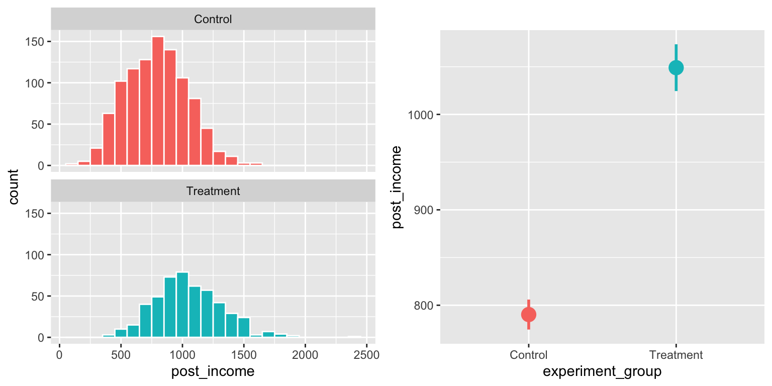
Alternatively, instead of creating two different villages and combining them, you can generate a treatment/control column and add an income bump for just treatment using ifelse():
village_all_at_once <- r_data_frame(
  n = 1500,
  age,
  sex(prob = c(0.6, 0.4)),
  group = group(prob = c(0.666, 0.333)),
  pre_income = rnorm(mean = 800, sd = 100),
  pct_boost_treatment = rnorm(mean = 1.3, sd = 0.3),
  pct_boost_control = rnorm(mean = 1, sd = 0.3)
) %>%
  mutate(post_income = ifelse(group == "Treatment",
                              pre_income * pct_boost_treatment,
                              pre_income * pct_boost_control)) %>%
  # Get rid of these columns since we don't need them anymore
  select(-pct_boost_treatment, -pct_boost_control)

head(village_all_at_once)
## # A tibble: 6 x 5
## Age Sex group pre_income post_income
## <int> <fct> <fct> <dbl> <dbl>
## 1 69 Male Treatment 776. 901.
## 2 32 Female Control 839. 859.
## 3 35 Female Treatment 921. 1187.
## 4 34 Male Control 830. 1058.
## 5 68 Female Control 935. 489.
## 6 54 Male Treatment 884. 1022.Diff-in-diff
To generate data for a diff-in-diff situation, you need data for treated and untreated groups, before and after treatment. Once again, there are a bunch of ways to do this. One way would be to make four datasets (city A before, city B before, city A after, city B after, for instance) and then combine them:
set.seed(1234)
city_a_before <- r_data_frame(
  n = 500,
  age,
  sex,
  income = rnorm(mean = 15000, sd = 2500)
) %>%
  mutate(city = "City A",
         year = 2010)

city_b_before <- r_data_frame(
  n = 500,
  age,
  sex,
  income = rnorm(mean = 13000, sd = 2500)
) %>%
  mutate(city = "City B",
         year = 2010)

city_a_after <- r_data_frame(
  n = 500,
  age,
  sex,
  income = rnorm(mean = 16000, sd = 2500)
) %>%
  mutate(city = "City A",
         year = 2011)

city_b_after <- r_data_frame(
  n = 500,
  age,
  sex,
  income = rnorm(mean = 19000, sd = 2500)
) %>%
  mutate(city = "City B",
         year = 2011)

city <- bind_rows(city_a_before, city_a_after,
                  city_b_before, city_b_after) %>%
  # Make year a category
  mutate(year = as.factor(year))

head(city)
## # A tibble: 6 x 5
## Age Sex income city year
## <int> <fct> <dbl> <chr> <fct>
## 1 45 Male 17120. City A 2010
## 2 39 Female 17272. City A 2010
## 3 26 Male 14343. City A 2010
## 4 22 Male 10486. City A 2010
## 5 55 Male 13472. City A 2010
## 6 33 Female 16215. City A 2010Once the data is combined, you can do regular diff-in-diff stuff, like finding the averages in each group and running a regression with an interaction term:
city_year_averages <- city %>%
  group_by(city, year) %>%
  summarize(avg_income = mean(income))
city_year_averages
## # A tibble: 4 x 3
## # Groups: city [2]
## city year avg_income
## <chr> <fct> <dbl>
## 1 City A 2010 14946.
## 2 City A 2011 15975.
## 3 City B 2010 13106.
## 4 City B 2011 19107.library(broom)
model_diff_diff <- lm(income ~ city + year + city * year, data = city)
tidy(model_diff_diff)## # A tibble: 4 x 5
## term estimate std.error statistic p.value
## <chr> <dbl> <dbl> <dbl> <dbl>
## 1 (Intercept) 14946. 112. 133. 0.
## 2 cityCity B -1840. 158. -11.6 2.97e-30
## 3 year2011 1029. 158. 6.50 1.03e-10
## 4 cityCity B:year2011 4972. 224. 22.2 9.40e-98ggplot(city_year_averages, aes(x = year, y = avg_income,
color = city, group = city)) +
geom_line(size = 1) +
theme(legend.position = "bottom")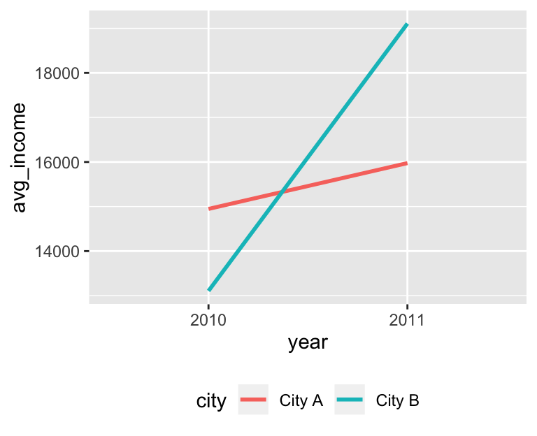
RDD
To making a synthetic RDD dataset, you need a running variable and an outcome variable. Here we’ll make a fake gifted program that students get into if they score an 80 on a pretest. We care about the program’s effect on high school GPAs. For fun, instead of trying to get the output of rbeta() to fit a range of test scores and GPAs, we’ll use rescale() to rescale the tiny numbers from rbeta() to more real-world levels.
gifted_program <- r_data_frame(
  n = 1000,
  id,
  pre_test = rbeta(shape1 = 7, shape2 = 2),
  gpa = rbeta(shape1 = 5, shape2 = 3)
) %>%
  # Beta distributions range from 0-1 naturally, so for the test score we'll
  # just multiply the pre_test by 100, so the maximum score will be 100
  mutate(pre_test = pre_test * 100) %>%
  # Then we'll put people in the program based on the cutoff
  mutate(in_program = pre_test >= 80) %>%
  # Next we can boost the GPA for those in the program with a math formula.
  # There are three parts here:
  # 1. (gpa * 40) makes the tiny random GPA score (0.243 or whatever) bigger.
  # 2. (10 * in_program) will add 10 points for those in the program
  # 3. (pre_test / 2) makes it so gpa is related to pretest scores and builds
  #    in a correlation
  #
  # You can adjust the 40 and 10 and 2 to change how spread out the data is,
  # how big the gap is, and how correlated test scores are to GPA, respectively
  mutate(gpa = (gpa * 40) + (10 * in_program) + (pre_test / 2)) %>%
  # Transform the meaningless tiny GPA score to something in the 2-4 scale
  mutate(gpa = rescale(gpa, to = c(2, 4))) %>%
  mutate(gpa = round(gpa, 2)) %>%
  mutate(pre_test_centered = pre_test - 80)
With this data, we can do standard RDD stuff, like looking at the discontinuity:
ggplot(gifted_program, aes(x = pre_test, y = gpa, color = in_program)) +
  geom_point(size = 0.5) +
  geom_smooth(method = "lm") +
  geom_vline(xintercept = 80) +
  guides(color = FALSE)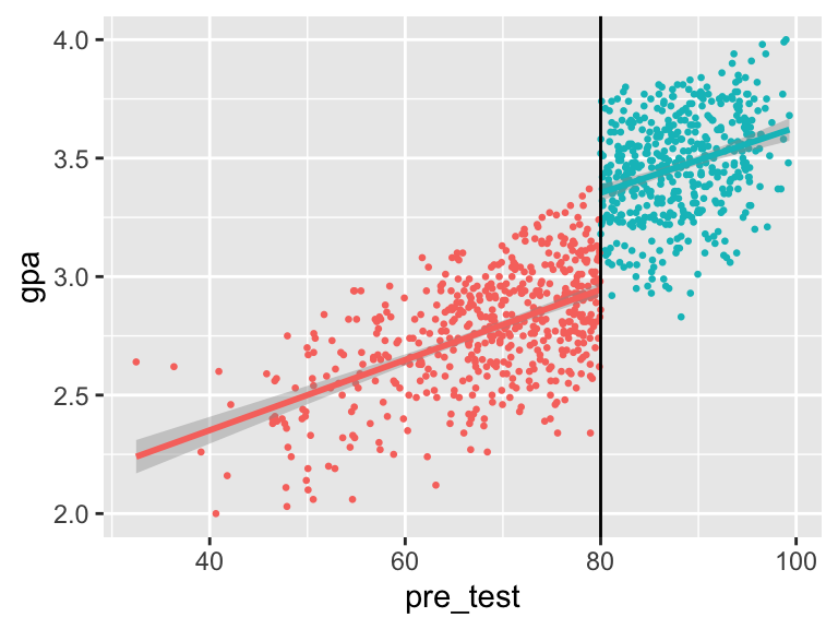
And measuring the size of the gap with a parametric model with a bandwidth of 10:
model_rdd_parametric <- lm(gpa ~ pre_test_centered + in_program,
                           data = filter(gifted_program, pre_test >= 70, pre_test <= 90))
tidy(model_rdd_parametric)
## # A tibble: 3 x 5
## term estimate std.error statistic p.value
## <chr> <dbl> <dbl> <dbl> <dbl>
## 1 (Intercept) 2.93 0.0188 155. 0.
## 2 pre_test_centered 0.0107 0.00303 3.52 4.68e- 4
## 3 in_programTRUE 0.441 0.0335 13.2 1.18e-34And measuring the size of the gap nonparametricaly:
library(rdrobust)

model_rdd_nonparametric <- rdrobust(y = gifted_program$gpa,
                                    x = gifted_program$pre_test,
                                    c = 80)
summary(model_rdd_nonparametric)
## Call: rdrobust
##
## Number of Obs. 1000
## BW type mserd
## Kernel Triangular
## VCE method NN
##
## Number of Obs. 525 475
## Eff. Number of Obs. 188 213
## Order est. (p) 1 1
## Order bias (p) 2 2
## BW est. (h) 6.765 6.765
## BW bias (b) 10.738 10.738
## rho (h/b) 0.630 0.630
##
## =============================================================================
## Method Coef. Std. Err. z P>|z| [ 95% C.I. ]
## =============================================================================
## Conventional 0.419 0.042 9.935 0.000 [0.336 , 0.501]
## Robust - - 8.232 0.000 [0.313 , 0.508]
## =============================================================================IV
Generating synthetic data for IV regression is a little trickier since you have to build in a correlation between the instrument and the policy and the policy and the outcome. Here’s one way to do that (again, there are a ton of different ways to do this; this is just one example), with wage as the outcome, education as the policy, and father’s years of education as the instrument that explains the endogeneity in education:
set.seed(1234)

wage_edu <- r_data_frame(
  n = 2000,
  id,
  sex,
  race,
  age,
  # Ability is the unmeasured, omitted variable. Here's it's a totally
  # meaningless number around 35
  ability = rnorm(mean = 35, sd = 10),
  # Instead of caring about years here, since we'll just rescale everything
  # after, we'll draw random numbers in the same range-ish as ability
  father_educ = rnorm(mean = 15, sd = 20),
  wage_noise = rnorm(mean = 10, sd = 2)
) %>%
  # Do some math to combine and correlate ability, father's education, and
  # random noise to make educ and wage. Note how father's education helps build
  # education, but doesn't appear in the wage formula---it's an instrument
  mutate(educ = 5 + (0.4 * father_educ) + (0.5 * ability)) %>%
  mutate(wage = 10 + (0.3 * educ) + wage_noise) %>%
  # Rescale stuff
  # Hourly wage goes from $7.75 to $200; education goes from 10-23 years;
  # unmeasured ability goes from 0 to 500
  mutate(wage = rescale(wage, to = c(7.75, 200)),
         educ = rescale(educ, to = c(10, 23)),
         father_educ = rescale(father_educ, to = c(10, 23)),
         ability = rescale(ability, to = c(0, 500))) %>%
  # Get rid of random wage noise. We could also get rid of ability, since we
  # can't measure it in real life, but I'll leave it here
  select(-wage_noise)

head(wage_edu)
## # A tibble: 6 x 8
## ID Sex Race Age ability father_educ educ wage
## <chr> <fct> <fct> <int> <dbl> <dbl> <dbl> <dbl>
## 1 0001 Male White 84 90.9 16.2 14.3 57.6
## 2 0002 Female White 34 246. 18.6 18.3 111.
## 3 0003 Female White 72 213. 15.2 15.0 75.4
## 4 0004 Female White 26 319. 15.0 16.3 95.5
## 5 0005 Female White 56 236. 16.9 16.8 121.
## 6 0006 Female Hispanic 28 126. 14.2 13.1 67.5Now we can do standard IV stuff, like look at the relationship between education and wages:
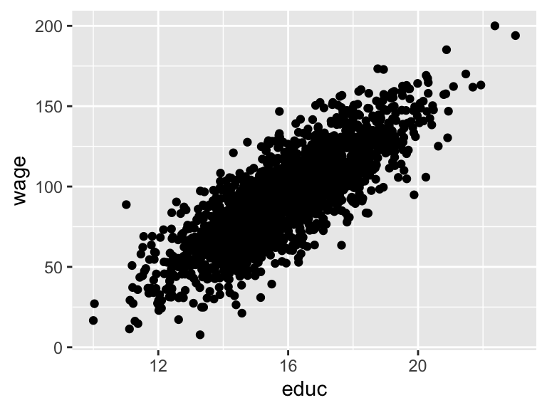
Check the strength of the instrument in the first stage (huge F-statistic!):
## # A tibble: 2 x 5
##   term        estimate std.error statistic  p.value
##   <chr>          <dbl>     <dbl>     <dbl>    <dbl>
## 1 (Intercept)    2.59     0.191       13.6 2.72e-40
## 2 father_educ 0.826 0.0118 70.3 0.## # A tibble: 1 x 11
## r.squared adj.r.squared sigma statistic p.value df logLik AIC BIC
## <dbl> <dbl> <dbl> <dbl> <dbl> <int> <dbl> <dbl> <dbl>
## 1 0.712 0.712 0.993 4944. 0 2 -2822. 5650. 5667.
## # … with 2 more variables: deviance <dbl>, df.residual <int>And run the 2SLS model with iv_robust():
library(estimatr)

model_2sls <- iv_robust(wage ~ educ | father_educ, data = wage_edu)
tidy(model_2sls)
## term estimate std.error statistic p.value conf.low conf.high
## 1 (Intercept) -104.3 3.69 -28.3 3.82e-148 -112 -97.1
## 2 educ 12.4 0.23 54.0 0.00e+00 12 12.9
## df outcome
## 1 1998 wage
## 2 1998 wageClearest and muddiest things
Go to this form and answer these three questions:
- What was the muddiest thing from class today? What are you still wondering about?
- What was the clearest thing from class today?
- What was the most exciting thing you learned?
I’ll compile the questions and send out answers after class.