Diff-in-diff II
Materials for class on Monday, October 28, 2019
Contents
Slides
Download the slides from today’s class.

Interpreting logged coefficients
Here’s a handy guide for interpreting regressions with logged coefficients.
In-class R work
Open the RStudio.cloud project for today or download the project to your computer, unzip it, and run it locally:
Complete diff-in-diff code
Here’s the example you all did in class. You can see the R Markdown version of all of this at GitHub.
library(tidyverse)
library(scales)
library(wooldridge)
library(broom)
library(huxtable)

kentucky <- injury %>%
  # Only look at data from Kentucky
  filter(ky == 1)
Background
In 1980, Kentucky raised its cap on weekly earnings that were covered by worker’s compensation.Worker’s compensation is “a form of insurance providing wage replacement and medical benefits to employees injured in the course of employment in exchange for mandatory relinquishment of the employee’s right to sue their employer for … negligence.” (Wikipedia)
The outcome variable is ldurat, which is the log duration (in weeks) of worker’s compensation benefits. It is logged because the variable is fairly skewed—most people are unemployed for a few weeks, with some unemployed for a long time. The policy was designed so that the cap increase did not affect low-earnings workers, but did affect high-earnings workers. Thus low-earnings workers serve as the control group, while high-earnings workers serve as the treatment group.
We want to know if the policy caused workers to spend more time unemployed. If benefits are not generous enough, then workers may sue the company for on-the-job injuries. On the other hand, benefits that are too generous may induce workers to be more reckless on the job, or to claim that off-the-job injuries were incurred while at work.
Exploratory data analysis
Look at the help file for injury. What do all these columns mean?
Because this is a dataset that comes with a package, the package authors decided to include a complete description of the dataset, which is great. You can see what all the columns are without having to consult a separate codebook file. You can see the help file either by searching for injury in the Help panel in RStudio, or by running ?injury in the console.
Look at the distribution of the duration of benefits (durat) using a histogram (choose an appropriate binwidth), facetted by high earners (highearn).
ggplot(data = kentucky, mapping = aes(x = durat)) +
  # I chose binwidth = 8 here, which makes each column represent 2 months (8
  # weeks). You can choose whatever binwidth looks good.
  geom_histogram(binwidth = 8, color = "white") +
  facet_wrap(~ highearn)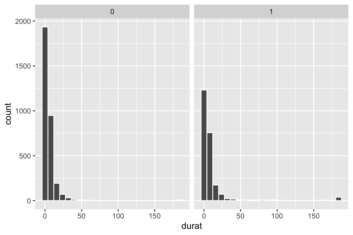
Make another plot using logged duration (ldurat).
ggplot(data = kentucky, mapping = aes(x = ldurat)) +
  geom_histogram(binwidth = 0.5, color = "white") +
  # Uncomment this line if you want to exponentiate the logged values on the
  # x-axis. Instead of showing 1, 2, 3, etc., it'll show e^1, e^2, e^3, etc. and
  # make the labels more human readable
  # scale_x_continuous(labels = trans_format("exp", format = round)) +
  facet_wrap(~ highearn)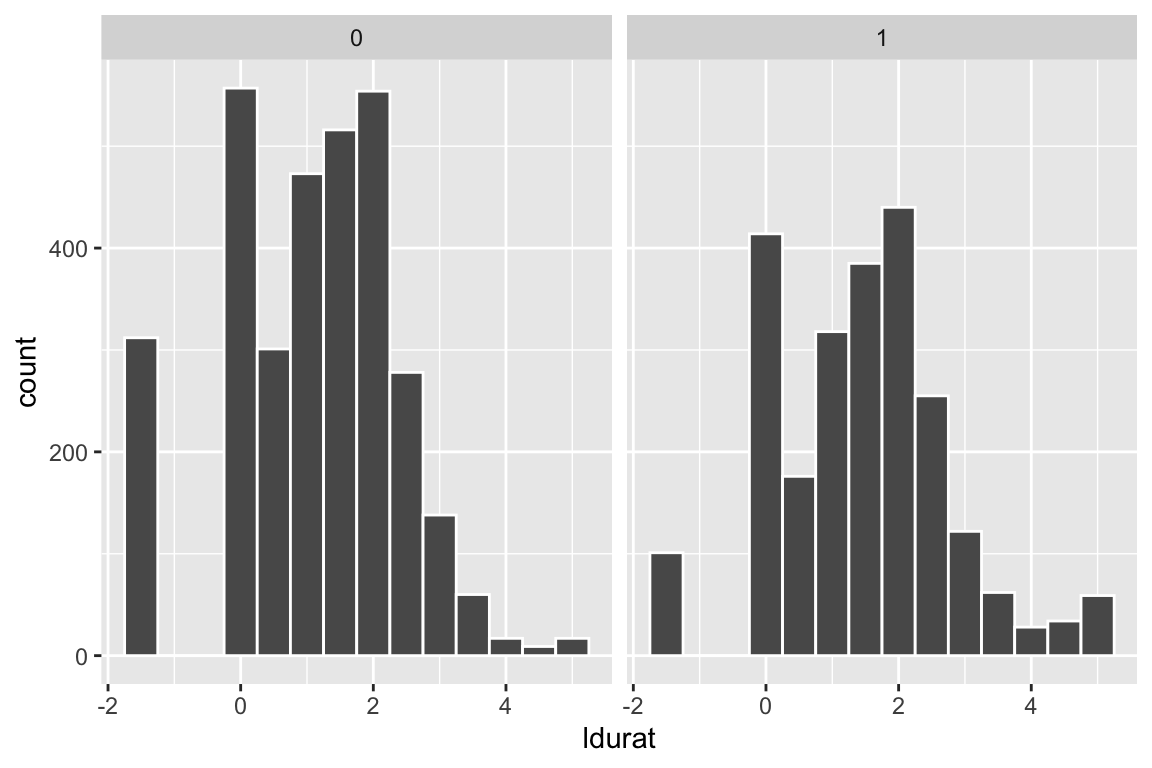
What’s the difference?
The distribution of weeks unemployed is heavily skewed, with most only unemployed for a few months at most. Among the high earners, there’s a weird cluser of people who have been unemployed for nearly 200 weeks, or four years (!).
Logging the duration of unemployment gives a more centralized distribution that works better with regression.
Diff-in-diff by hand
Calculate the difference-in-differences based on the pre- and post-means for the treatment and control groups. Remember that the pre/post variable is afchnge and the treatment/control variable is highearn.
kentucky_diff <- kentucky %>%
  group_by(afchnge, highearn) %>%
  summarize(avg_durat = mean(ldurat),
            avg_durat_for_humans = mean(durat))
kentucky_diff
## # A tibble: 4 x 4
## # Groups: afchnge [2]
## afchnge highearn avg_durat avg_durat_for_humans
## <int> <int> <dbl> <dbl>
## 1 0 0 1.13 6.27
## 2 0 1 1.38 11.2
## 3 1 0 1.13 7.04
## 4 1 1 1.58 12.9before_treatment <- kentucky_diff %>%
filter(afchnge == 0, highearn == 1) %>% pull(avg_durat)
before_control <- kentucky_diff %>%
filter(afchnge == 0, highearn == 0) %>% pull(avg_durat)
after_treatment <- kentucky_diff %>%
filter(afchnge == 1, highearn == 1) %>% pull(avg_durat)
after_control <- kentucky_diff %>%
filter(afchnge == 1, highearn == 0) %>% pull(avg_durat)
diff_treatment_before_after <- after_treatment - before_treatment
diff_control_before_after <- after_control - before_control
diff_diff <- diff_treatment_before_after - diff_control_before_after
diff_before_treatment_control <- before_treatment - before_control
diff_after_treatment_control <- after_treatment - after_control
other_diff_diff <- diff_after_treatment_control - diff_before_treatment_controlMake a table of the ABCD values:
| Before change | After change | Difference | |
|---|---|---|---|
| High earners | 1.382 | 1.58 | 0.198 |
| Low earners | 1.126 | 1.133 | 0.008 |
| Difference | 0.256 | 0.447 | 0.191 |
What is the difference in the differences estimate? Interpret it. (Remember that the outcome variable is logged.)
The diff-in-diff estimate is 0.191, which means that the program causes an increase in unemployment duration of 0.19 logged weeks. Logged weeks is nonsensical, though, so we have to interpret it with percentages (recall this handy guide; this is Example B, where the dependent/outcome variable is logged). Receiving the treatment (i.e. being a high earner after the change in policy) causes a 19.1% increase in the length of unemployment.
Plot of diff-in-diff
Store your group_by() %>% summarize() table above as an object and plot it with ggplot. Put afchnge on the x-axis, average duration on the y-axis, and color the lines by highearn. Is there an effect?
There’s an effect!
Important: afchnge and highearn are in the dataset as numbers (0 and 1), but they’re actually categories. We have to tell R to treat them as categories (or factors), otherwise it’ll assume you can have a highearn value of 0.58 or something. To do this, wrap the variable name in as.factor(), like x = as.factor(afchnge).
Also, to make ggplot draw lines acroww the before/after groups on the x-axis, you’ll need to set the group aesthetic in geom_line(): geom_line(aes(group = as.factor(highearn))). You only have to do with when the x variable is a category; you don’t have to do this in problem set 7 since x is year, and that’s not a category.
ggplot(kentucky_diff, aes(x = as.factor(afchnge),
                          y = avg_durat,
                          color = as.factor(highearn))) +
  geom_line(aes(group = as.factor(highearn))) #+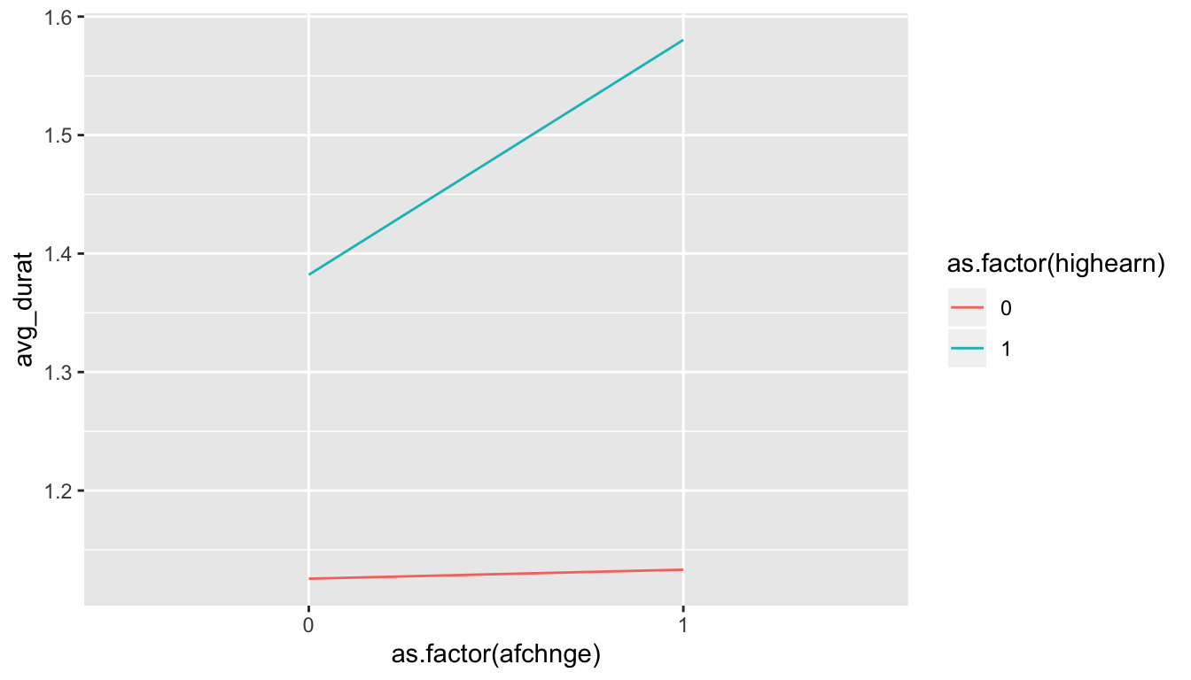
  # If you uncomment these lines you'll get some extra annotation lines and
  # labels. The annotate() function lets you put stuff on a ggplot that's not
  # part of a dataset. Normally with geom_line, geom_point, etc., you have to
  # plot data that is in columns. With annotate() you can specify your own x and
  # y values.
  # annotate(geom = "segment", x = "0", xend = "1",
  #          y = before_treatment, yend = after_treatment - diff_diff,
  #          linetype = "dashed", color = "grey50") +
  # annotate(geom = "segment", x = "1", xend = "1",
  #          y = after_treatment, yend = after_treatment - diff_diff,
  #          linetype = "dotted", color = "blue") +
  # annotate(geom = "label", x = "1", y = 1.48, label = "Program effect",
  #          size = 3)

# Here, all the as.factor changes are directly in the ggplot code. I generally
# don't like doing this and prefer to do that separately so there's less typing
# in the ggplot code, like this:
#
# kentucky_diff <- kentucky_diff %>%
#   mutate(afchnge = as.factor(afchnge), highearn = as.factor(highearn))
#
# ggplot(kentucky_diff, aes(x = afchnge, y = avg_durat, color = highearn)) +
#   geom_line(aes(group = highearn))
Diff-in-diff with regression
Now, instead of calculating the group averages by hand, use regression to find the diff-in-diff estimate. Remember that you’ll need to include indicator variables for treatment/control and before/after, as well as the interaction of the two. Here’s what the math equation looks like:
\[ \log(\text{durat}) = \alpha + \beta \ \text{highearn} + \gamma \ \text{afchnge} + \delta \ (\text{highearn} \times \text{afchnge}) + \epsilon \]
The \(\delta\) value is the one you care about.
model_small <- lm(ldurat ~ highearn + afchnge + highearn * afchnge,
                  data = kentucky)
tidy(model_small)| term | estimate | std.error | statistic | p.value |
| (Intercept) | 1.13 | 0.0307 | 36.6 | 1.62e-263 |
| highearn | 0.256 | 0.0474 | 5.41 | 6.72e-08 |
| afchnge | 0.00766 | 0.0447 | 0.171 | 0.864 |
| highearn:afchnge | 0.191 | 0.0685 | 2.78 | 0.00542 |
Compare the value of the interaction term with the diff-in-diff estimate you calculated by hand. Is it the same? (it should be!). Is it statistically significant?
The coefficient for highearn:afchnge is the same, as it should be! It is statistically significant, so we can be fairily confident that it is not 0.
Diff-in-diff with regression + controls
One advantage to using regression for diff-in-diff is that you can include control variables to help isolate the effect. For example, perhaps claims made by construction or manufacturing workers tend to have longer duration than claims made workers in other industries. Or maybe those claiming back injuries tend to have lonter claims than those claiming head injuries. One may also want to control for worker demographics such as gender, marital status, and age.
Estimate an expanded version of the basic regression model with the following additional variables:
malemarriedagehosp(1 = hospitalized)indust(1 = manuf, 2 = construc, 3 = other)injtype(1-8; categories for different types of injury)lprewage(log of wage prior to filing a claim)
Important: indust and injtype are in the dataset as numbers (1-3 and 1-8), but they’re actually categories. We have to tell R to treat them as categories (or factors), otherwise it’ll assume that you can have an injury type of 3.46 or something impossible.
# Convert industry and injury type to categories/factors
kentucky <- kentucky %>%
  mutate(indust = as.factor(indust),
         injtype = as.factor(injtype))
model_big <- lm(ldurat ~ highearn + afchnge + highearn * afchnge +
male + married + age + hosp + indust + injtype + lprewage,
data = kentucky)
tidy(model_big)| term | estimate | std.error | statistic | p.value |
| (Intercept) | -1.53 | 0.422 | -3.62 | 0.000298 |
| highearn | -0.152 | 0.0891 | -1.7 | 0.0886 |
| afchnge | 0.0495 | 0.0413 | 1.2 | 0.231 |
| male | -0.0843 | 0.0423 | -1.99 | 0.0464 |
| married | 0.0567 | 0.0373 | 1.52 | 0.129 |
| age | 0.00651 | 0.00134 | 4.86 | 1.19e-06 |
| hosp | 1.13 | 0.037 | 30.5 | 5.2e-189 |
| indust2 | 0.184 | 0.0541 | 3.4 | 0.000687 |
| indust3 | 0.163 | 0.0379 | 4.32 | 1.6e-05 |
| injtype2 | 0.935 | 0.144 | 6.51 | 8.29e-11 |
| injtype3 | 0.635 | 0.0854 | 7.44 | 1.19e-13 |
| injtype4 | 0.555 | 0.0928 | 5.97 | 2.49e-09 |
| injtype5 | 0.641 | 0.0854 | 7.51 | 7.15e-14 |
| injtype6 | 0.615 | 0.0863 | 7.13 | 1.17e-12 |
| injtype7 | 0.991 | 0.191 | 5.2 | 2.03e-07 |
| injtype8 | 0.434 | 0.119 | 3.65 | 0.000264 |
| lprewage | 0.284 | 0.0801 | 3.55 | 0.000383 |
| highearn:afchnge | 0.169 | 0.064 | 2.64 | 0.00838 |
Is the diff-in-diff estimate different now? How so? Is it significant?
After controlling for a host of demographic controls, the diff-in-diff estimate is smaller (0.169), indicating that the policy caused a 16.9% increase in the duration of weeks unemployed following a workplace injury. It is smaller because the other independent variables now explain some of the variation in ldurat.
Comparison of regression models
Put the results from the two models in a side-by-side table using huxreg(name_of_simple_model, name_of_bigger_model):
Putting the model coefficients side-by-side like this makes it easy to compare the value for highearn:afchnge as we change the model:
| (1) | (2) | |
| (Intercept) | 1.126 *** | -1.528 *** |
| (0.031) | (0.422) | |
| highearn | 0.256 *** | -0.152 |
| (0.047) | (0.089) | |
| afchnge | 0.008 | 0.050 |
| (0.045) | (0.041) | |
| highearn:afchnge | 0.191 ** | 0.169 ** |
| (0.069) | (0.064) | |
| male | -0.084 * | |
| (0.042) | ||
| married | 0.057 | |
| (0.037) | ||
| age | 0.007 *** | |
| (0.001) | ||
| hosp | 1.130 *** | |
| (0.037) | ||
| indust2 | 0.184 *** | |
| (0.054) | ||
| indust3 | 0.163 *** | |
| (0.038) | ||
| injtype2 | 0.935 *** | |
| (0.144) | ||
| injtype3 | 0.635 *** | |
| (0.085) | ||
| injtype4 | 0.555 *** | |
| (0.093) | ||
| injtype5 | 0.641 *** | |
| (0.085) | ||
| injtype6 | 0.615 *** | |
| (0.086) | ||
| injtype7 | 0.991 *** | |
| (0.191) | ||
| injtype8 | 0.434 *** | |
| (0.119) | ||
| lprewage | 0.284 *** | |
| (0.080) | ||
| N | 5626 | 5347 |
| R2 | 0.021 | 0.190 |
| logLik | -9321.997 | -8323.388 |
| AIC | 18653.994 | 16684.775 |
| *** p < 0.001; ** p < 0.01; * p < 0.05. | ||
Clearest and muddiest things
Go to this form and answer these three questions:
- What was the muddiest thing from class today? What are you still wondering about?
- What was the clearest thing from class today?
- What was the most exciting thing you learned?
I’ll compile the questions and send out answers after class.